A decorative name card: check legibility without changing the spelling
A beautiful typeface can make particular letters difficult to distinguish, especially in a small keepsake or a photograph. Treat that as a design question rather than evidence that the chosen spelling is wrong. Compare a plain reference with the decorative version, preserving the actual characters while changing the presentation around them.
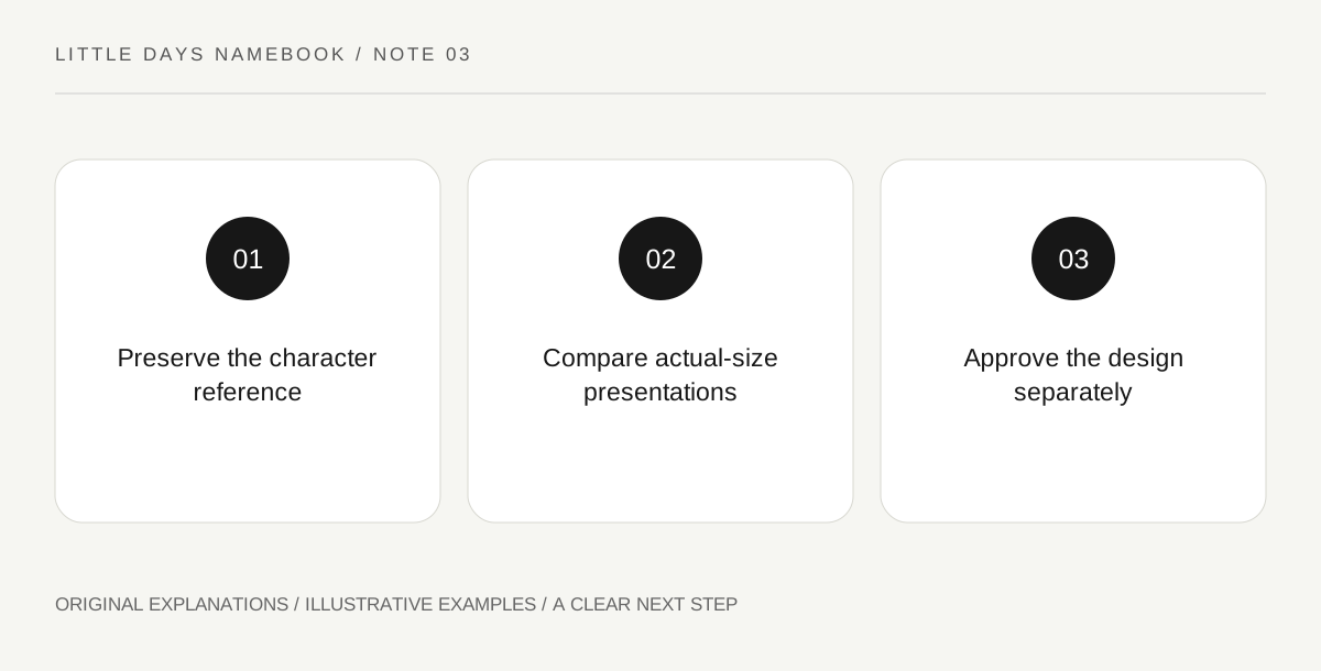
Original explanatory diagram. Read the full method and limitations below.
Keep characters and appearance separate
Unicode’s security guidance discusses the general issue of visually confusable text. For a decorative family card, the useful distinction is simpler: the intended characters are one record, and their appearance in a selected font is another. Keep a plain reference copied from the parents’ chosen form. Do not use a decorative sample as the only spelling authority. This article does not certify official-document acceptance or analyze a particular script’s naming rules. It offers an original visual check for a non-official keepsake.
Compare one variable at a time
Place the same fictional name in a plain typeface and two decorative alternatives at the size you intend to display. Ask a trusted reader what they see without first telling them the spelling. If a letter is repeatedly mistaken, try a different font, size or spacing before considering any change to the underlying name. The experiment concerns the chosen presentation and a few readers, not a universal readability study. A narrow comparison helps you identify a design problem without turning an individual response into a verdict on the name itself.
Test the actual viewing context
A card held nearby and a card seen in a small shared image are different presentations. Make a sample at the intended scale and inspect the ordinary view in which it will be used. Do not judge only from an enlarged design canvas. Preserve marks and letterforms that belong to the name rather than dropping them to make a layout convenient. If the font cannot represent the chosen form clearly, select a better-supported design. Decorative flexibility should serve the name rather than quietly rewriting it.
Make the reference easy to find later
Store the approved plain form with the design file and label the decorative card as a keepsake layout. Avoid turning it into a substitute for an authority’s actual form instructions. If somebody later copies the name from the artwork, offer the plain reference so ornament does not become an accidental transcription. The final result can still be expressive: color, border and composition provide many options without obscuring the letters. A good name card is both attractive and faithful to the form the family intended.
Illustrative family example
Illustrative comparison: a family tests the fictional display name Lina in three typefaces on an ordinary paper card. One small decorative version makes the initial letter ambiguous to a reader. They change the font and spacing while preserving the spelling, then save the plain reference beside the approved artwork. The exercise is described as a keepsake design check, not a test of official record compatibility.
Questions that come up
Does a confusing font mean the name needs a different spelling?
That conclusion does not follow. The difficulty may lie in presentation. Try a clearer supported typeface while preserving the intended form.
Does a readable keepsake prove an official form will accept the name?
No. Official records have their own requirements and processes. This exercise concerns a decorative card only.
References and scope
These sources support the factual background. Examples and exercises are original illustrative teaching material. References do not imply endorsement.
- Unicode Technical Standard #39: Unicode Security Mechanisms — The general distinction between text and visually confusable presentation; original non-official card exercise, no naming-rule or document-acceptance claim.